* 'RFM 분석'이란?

- 온라인 리테일에서 고객 군집을 고객의 Recency구매 최근성, Frequency구매 빈도, Monetary구매 금액을 기준으로 나누고 각군집이 어떻게 유지되고 변화하는지에 따라서 현재 비즈니스 상태를 파악하고 문제가 있다면 어떻게 대응해야 할지를 판단하는데 쓰는 방법
- RFM은 고객에게 R, F, M 각각의 점수를 부여하고 그 다음에 점수들을 다시 몇개의 그룹으로 묶은 뒤에 세분화된 고객 그룹을 관리함
* 전체 분석과정
1. 전체 데이터 확인
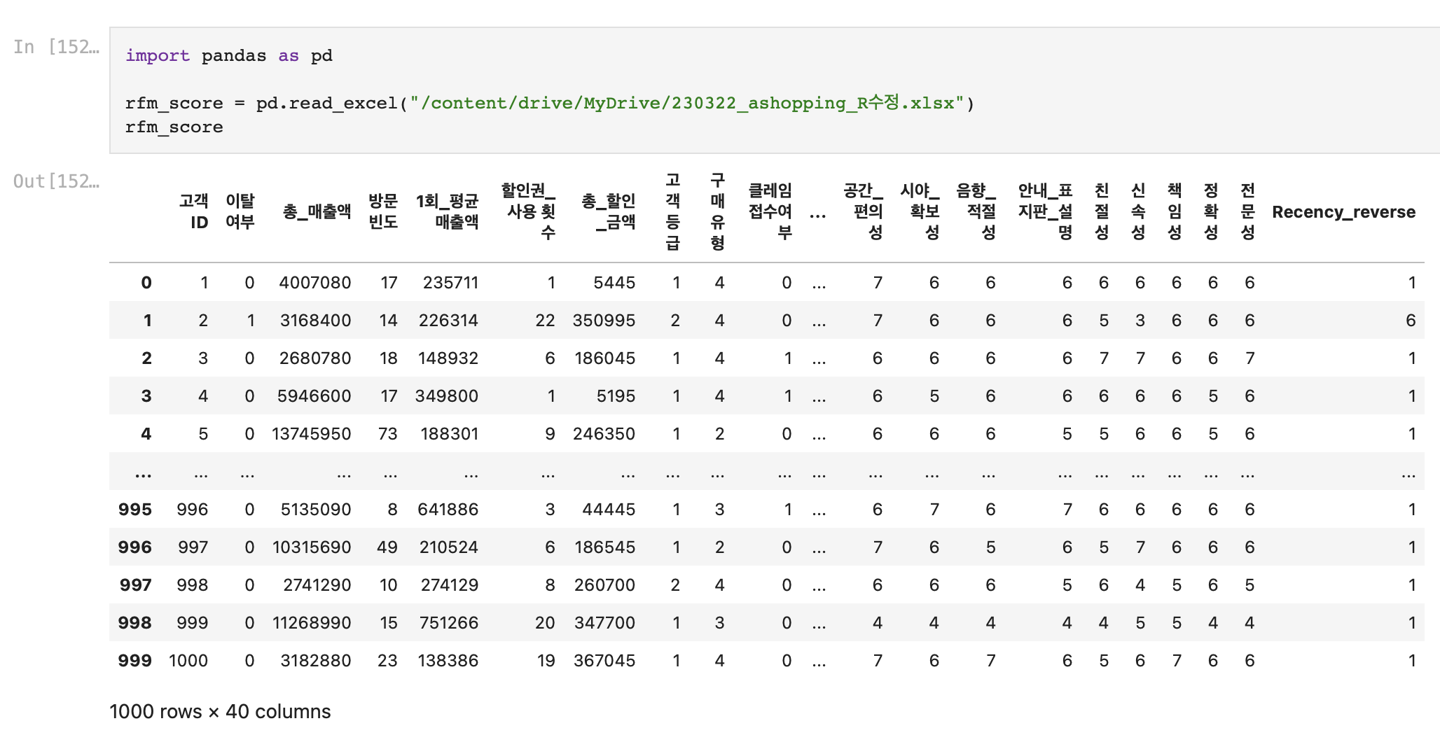
먼저 가지고있는 'ashopping' 파일을 구글 드라이브에서 마운트 해오고
전체 데이터의 분포를 확인해보았다.
2. RFM 분포 확인
해당 데이터에서는 Recency, Frequency, Monetary 점수가 1~7까지의 범위로 이미 제공되어 있었다.
세가지 모두 숫자가 높아질수록 좋은 점수라고 가정했다.
따라서 따로 각각의 점수를 관련된 데이터를 통해 따로 도출할 필요는 없었다.
먼저 세 변수의 데이터 분포를 시각화해서 확인해보았다.
(1) Recency
# 'Recency'별 데이터 개수 바 차트로 확인
# '최근성' 점수

import matplotlib.pyplot as plt
import seaborn as sns
from collections import Counter

region_data = Counter(df['Recency']).most_common() ## 데이터 개수가 많은 순으로 출력
region_data = region_data[:7] ## 데이터 범주 1~7

data = [x[1] for x in region_data]
regions = [x[0] for x in region_data]

## 수평 바차트에서 데이터 개수와 나라를 맨위로 출력하기 위해서 리스트 순서를 바꿈
regions.reverse()
data.reverse()

## 시각화
fig =plt.figure(figsize=(8,8))

fig.set_facecolor('white') ## 캔버스 색깔
colors = sns.color_palette('hls',len(data)) ## color 생성
plt.yticks(fontsize=15) # y축 눈금 라벨 폰트사이즈 설정
plt.xticks(fontsize=12) # x축 눈금 라벨 폰트사이즈 설정

plt.barh(regions, data, color=colors,alpha=0.6,edgecolor='k') ## 수평바차트 생성
plt.show()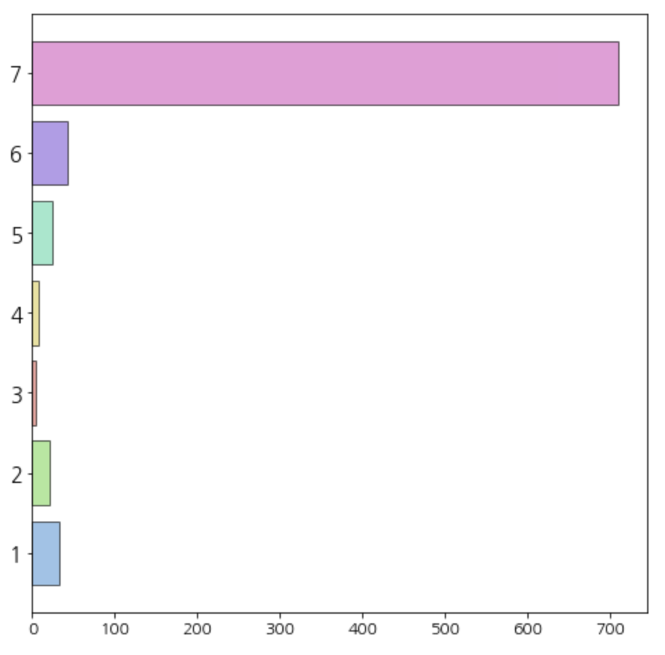
Recency의 분포가 굉장히 이상했다.
7점이 가장 높은 점수인데, 가장 높은 점수를 가진 고객이 너무 많이 분포해있었다.
아무 정보없이 받았던 데이터 파일이었기 때문에, '최근에 방문한 고객보다, 예전에 방문했던 고객이 대부분일 것이다' 라는 가정을 두고
Recency 데이터를 뒤집어서 'Recency_reverse'라는 변수로 다시 저장했다.
(2) Frequency
# 'Frequency'별 데이터 개수 바 차트로 확인
# '구매빈도' 점수

import matplotlib.pyplot as plt
import seaborn as sns
from collections import Counter

region_data = Counter(df['Frequency']).most_common()
region_data = region_data[:7]

data = [x[1] for x in region_data]
regions = [x[0] for x in region_data]


regions.reverse()
data.reverse()

## 시각화
fig =plt.figure(figsize=(8,8))

fig.set_facecolor('white')
colors = sns.color_palette('hls',len(data))
plt.yticks(fontsize=15)
plt.xticks(fontsize=12)

plt.barh(regions, data, color=colors,alpha=0.6,edgecolor='k')
plt.show()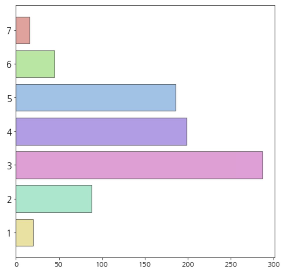
(3) Monetary
# 'Monetary'별 데이터 개수 바 차트로 확인
# '구매액' 점수

import matplotlib.pyplot as plt
import seaborn as sns
from collections import Counter

region_data = Counter(df['Monetary']).most_common()
region_data = region_data[:7]

data = [x[1] for x in region_data]
regions = [x[0] for x in region_data]

regions.reverse()
data.reverse()

## 시각화
fig =plt.figure(figsize=(8,8))

fig.set_facecolor('white')
colors = sns.color_palette('hls',len(data))
plt.yticks(fontsize=15)
plt.xticks(fontsize=12)

plt.barh(regions, data, color=colors,alpha=0.6,edgecolor='k')
plt.show()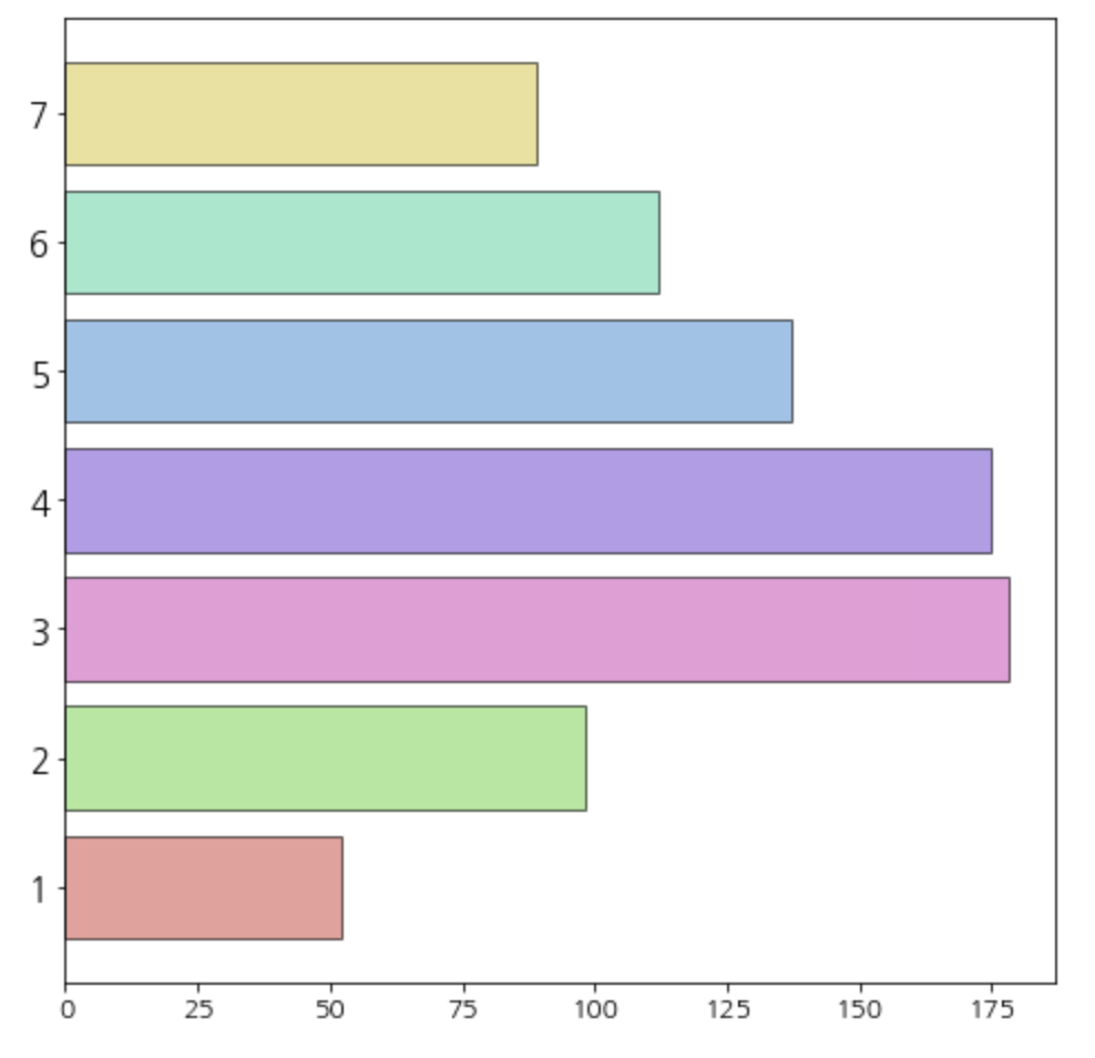
3. RFM분석 과정
(1) 새로운 데이터 확인
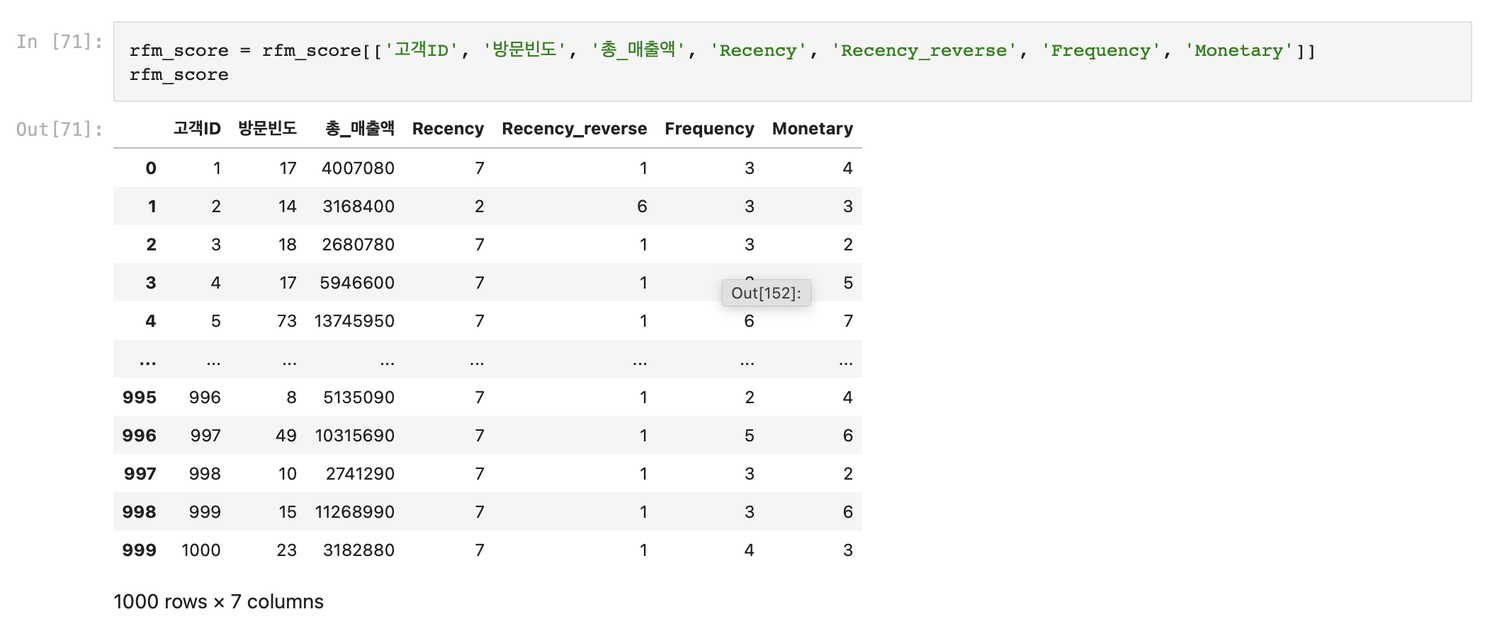
Recency_reverse 변수를 추가한 데이터를 다시 가져왔다.
(2) 매출 기여도의 분산을 최대화하는 가중치 찾기
내가 가진 데이터의 RFM은 1~7까지의 범위를 가지고 있어서, 고객 Class를 7개로 나누었다. (num_class)
import pandas as pd
import numpy as np
from tqdm import tqdm

##최적 가중치 찾기 위한 함수 및 사전 준비 코드

def get_score(level, data, reverse = False):

    score = []
    for j in range(len(data)):
        for i in range(len(level)):
            if data[j] <= level[i]:
                score.append(i+1)
                break
            elif data[j] > max(level):
                score.append(len(level)+1)
                break
            else:
                continue
    if reverse:
        return [len(level)+2-x for x in score]
    else:
        return score

 grid_number = 100 ## 눈금 개수, 너무 크게 잡으면 메모리 문제가 발생할 수 있음.
weights = []
for j in range(grid_number+1):
    weights += [(i/grid_number,j/grid_number,(grid_number-i-j)/grid_number)
                  for i in range(grid_number+1-j)]
num_class = 7 ## 클래스 개수
class_level = np.linspace(1,7,num_class+1)[1:-1] ## 클래스를 나누는 지점을 정한다.
total_amount_of_sales = rfm_score['총_매출액'].sum()

print(class_level)
해당 결과값의 의미는 이렇다.
- 가중치와 RFM 점수를 이용한 총 점수가 6.142보다 크면 Class 1
- 가중치와 RFM 점수를 이용한 총 점수가 1.857보다 작으면 Class 7
max_std = 0 ## 표준편차 초기값
for w in tqdm(weights,position=0,desc = '[Finding Optimal weights]'):
    ## 주어진 가중치에 따른 고객별 점수 계산
    score = w[0]*rfm_score['Recency_reverse'] + \
                        w[1]*rfm_score['Frequency'] + \
                        w[2]*rfm_score['Monetary']
    rfm_score['Class'] = get_score(class_level,score,True) ## 점수를 이용하여 고객별 등급 부여
    ## 등급별로 구매금액을 집계한다.
    grouped_rfm_score = rfm_score.groupby('Class')['총_매출액'].sum().reset_index()

    ## 클래스별 구매금액을 총구매금액으로 나누어 클래스별 매출 기여도 계산
    grouped_rfm_score['총_매출액'] = grouped_rfm_score['총_매출액'].map(lambda x : x/total_amount_of_sales)
    std_sales = grouped_rfm_score['총_매출액'].std() ## 매출 기여도의 표준편차 계산
    if max_std <= std_sales:
        max_std = std_sales ## 표준편차 최대값 업데이트
        optimal_weights = w  ## 가중치 업데이트

print(optimal_weights)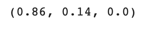
데이터 수가 많을수록 이 코드를 돌리는데 시간이 굉장히 오래 걸린다..
나는 1000개의 데이터였는데 약 3분정도 돌아갔다.
결과값으로 Recency, Frequency, Monetary에 각각 0.86, 0.14, 0.0의 가중치가 나왔다.
3) 가중치와 RFM점수를 이용하여 고객별로 등급 부여
score = optimal_weights[0]*rfm_score['Recency_reverse'] + \
        optimal_weights[1]*rfm_score['Frequency'] + \
        optimal_weights[2]*rfm_score['Monetary'] ## 고객별 점수 계산

rfm_score['Class'] = get_score(class_level,score,True) ## 고객별 등급 부여
4) 각 등급별 매출 기여도 확인
## 클래스별 고객 수 계산
temp_rfm_score1 = rfm_score.groupby('Class')['고객ID'].count().reset_index().rename(columns={'고객ID':'Count'})

## 클래스별 구매금액(매출)계산
temp_rfm_score2 = rfm_score.groupby('Class')['총_매출액'].sum().reset_index()

## 클래스별 매출 기여도 계산
temp_rfm_score2['총_매출액'] = temp_rfm_score2['총_매출액'].map(lambda x : x/total_amount_of_sales)

## 데이터 결합
result_df = pd.merge(temp_rfm_score1,temp_rfm_score2,how='left',on=('Class'))

result_df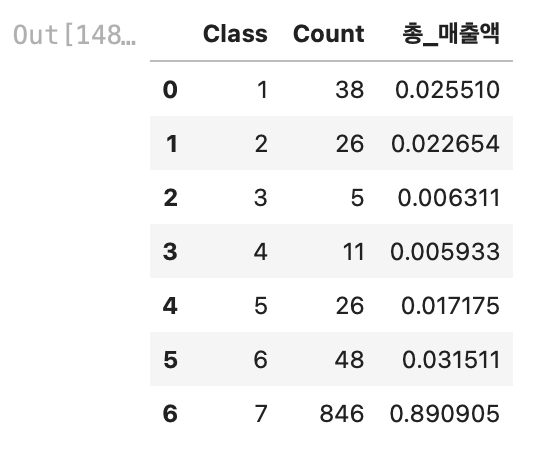
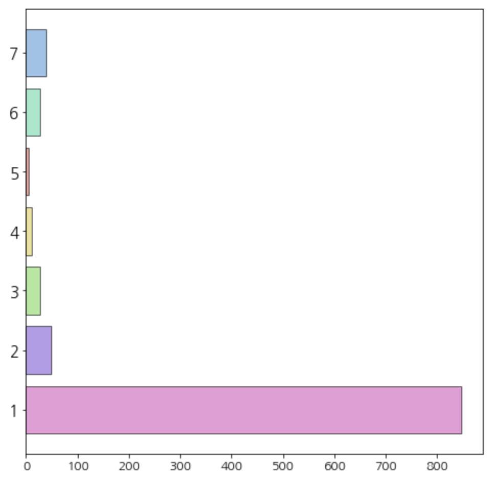
결과값이 조금 이상했다.
7등급 고객이 1000명 중 846명이었고, 매출액의 기여도가 89%였다. (어떻게 보면 당연한 소리)
나는 Recency의 분포가 굉장히 불균형한데 거기에 가중치까지 0.86으로 적용해서 Class7이 너무 많이 나왔다고 생각했다.
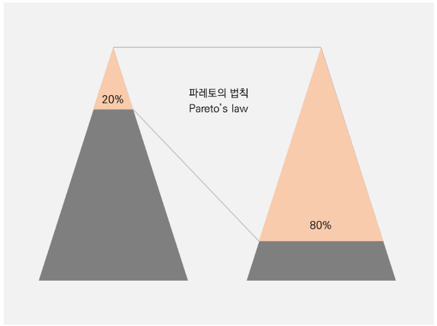
파레토의 법칙에 따르면, 고객군의 20%가 매출의 80%에 기여한다.
참고한 블로그에서도 비슷한 결과값이 나왔어서 가중치를 구하는 코드에 파레토의 법칙에 따른 제약조건을 추가시키셨다.
5) 제약조건 추가 "등급이 높을수록 매출 기여도가 높아야 한다. "
max_std = 0 ## 표준편차 초기값
for w in tqdm(weights,position=0,desc = '[Finding Optimal weights]'):
    ## 주어진 가중치에 따른 고객별 점수 계산
    score = w[0]*rfm_score['Recency_reverse'] + \
                        w[1]*rfm_score['Frequency'] + \
                        w[2]*rfm_score['Monetary']
    rfm_score['Class'] = get_score(class_level,score,True) ## 점수를 이용하여 고객별 등급 부여
    ## 등급별로 구매금액을 집계한다.
    grouped_rfm_score = rfm_score.groupby('Class')['총_매출액'].sum().reset_index()

    ## 제약조건 추가 - 등급이 높은 고객들의 매출이 낮은 등급의 고객들보다 커야한다.
    grouped_rfm_score = grouped_rfm_score.sort_values('Class')

    temp_monetary = list(grouped_rfm_score['총_매출액'])
    if temp_monetary != sorted(temp_monetary,reverse=True):
        continue

    ## 클래스별 구매금액을 총구매금액으로 나누어 클래스별 매출 기여도 계산
    grouped_rfm_score['총_매출액'] = grouped_rfm_score['총_매출액'].map(lambda x : x/total_amount_of_sales)
    std_sales = grouped_rfm_score['총_매출액'].std() ## 매출 기여도의 표준편차 계산
    if max_std <= std_sales:
        max_std = std_sales ## 표준편차 최대값 업데이트
        optimal_weights = w  ## 가중치 업데이트

 print(optimal_weights)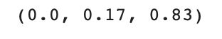
가중치가 역시 다르게 나왔다.
이제는 Recency의 가중치가 0.0이 된것을 알 수 있다.
해당 가중치를 사용하여 결과값을 다시 도출해보았다.
score = optimal_weights[0]*rfm_score['Recency_reverse'] + \
        optimal_weights[1]*rfm_score['Frequency'] + \
        optimal_weights[2]*rfm_score['Monetary'] ## 고객별 점수 계산

rfm_score['Class'] = get_score(class_level,score,True) ## 고객별 등급 부여

## 클래스별 고객 수 계산
temp_rfm_score1 = rfm_score.groupby('Class')['고객ID'].count().reset_index().rename(columns={'고객ID':'Count'})

## 클래스별 구매금액(매출)계산
temp_rfm_score2 = rfm_score.groupby('Class')['총_매출액'].sum().reset_index()

## 클래스별 매출 기여도 계산
temp_rfm_score2['총_매출액'] = temp_rfm_score2['총_매출액'].map(lambda x : x/total_amount_of_sales)

## 데이터 결합
result_df = pd.merge(temp_rfm_score1,temp_rfm_score2,how='left',on=('Class'))

result_df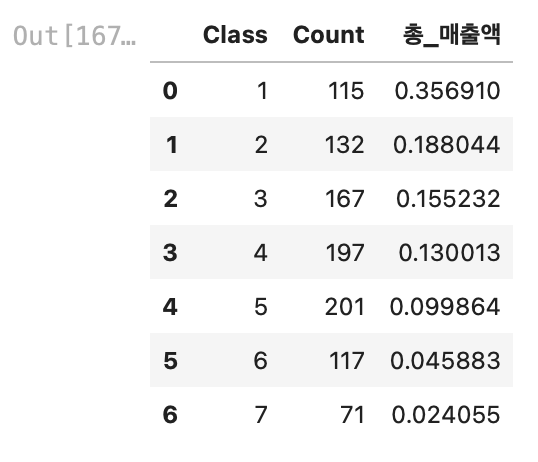
나름 파레토에 법칙에 부합하는 결과값이 나왔다.
Class 1, 2를 보면 1000명의 고객 중 약 250명의 고객이(25%), 매출의 약 55%에 기여하고 있었다.
우리 팀은 향후 Class 1,2의 고객 데이터만 뽑아서 이들을 VIP로 지정하고 VIP 마케팅을 기획해 보았다! (다음에 포스팅 예정..)
<출처>
RFM분석에서 사용한 모든 코드는 아래 블로그 글을 참고했다!
파이썬 데이터 분석에 관련된 유용한 글들이 아주 많아서 구독까지 했다😎🔥 좋은 코드 감사합니다!!!
https://zephyrus1111.tistory.com/16
[RFM 고객 분석] 3. Python을 이용한 RFM 분석 - RFM 가중치 계산
안녕하세요~ 꽁냥이에요. 오늘은 RFM 고객 분석의 마지막 내용으로 RFM 가중치를 계산하는 방법에 대해 소개하려고 합니다. RFM 고객 분석에 대한 기본개념과 RFM 점수 계산에 대한 내용은 아래 포
zephyrus1111.tistory.com
'Python > Small Project' 카테고리의 다른 글
| [Python]Galaxy Z Flip·Fold5 소비자 반응 수집(네이버 데이터랩, 빅카인즈 기사, 유튜브 댓글 크롤링&시각화) (1) | 2023.08.15 |
|---|---|
| [Python]LG그램&뉴진스 YouTube M/V 댓글 크롤링 후 텍스트 마이닝 시각화 해보기 (10) | 2023.01.31 |
| [Python ML]KOSIS 통계자료를 활용하여 5가지 모델 성능 비교해보기 (0) | 2023.01.24 |
| [Python Data Analysis]선형 회귀분석을 통해 'BMI지수'에 영향을 주는 요소 알아보기 (0) | 2023.01.16 |